
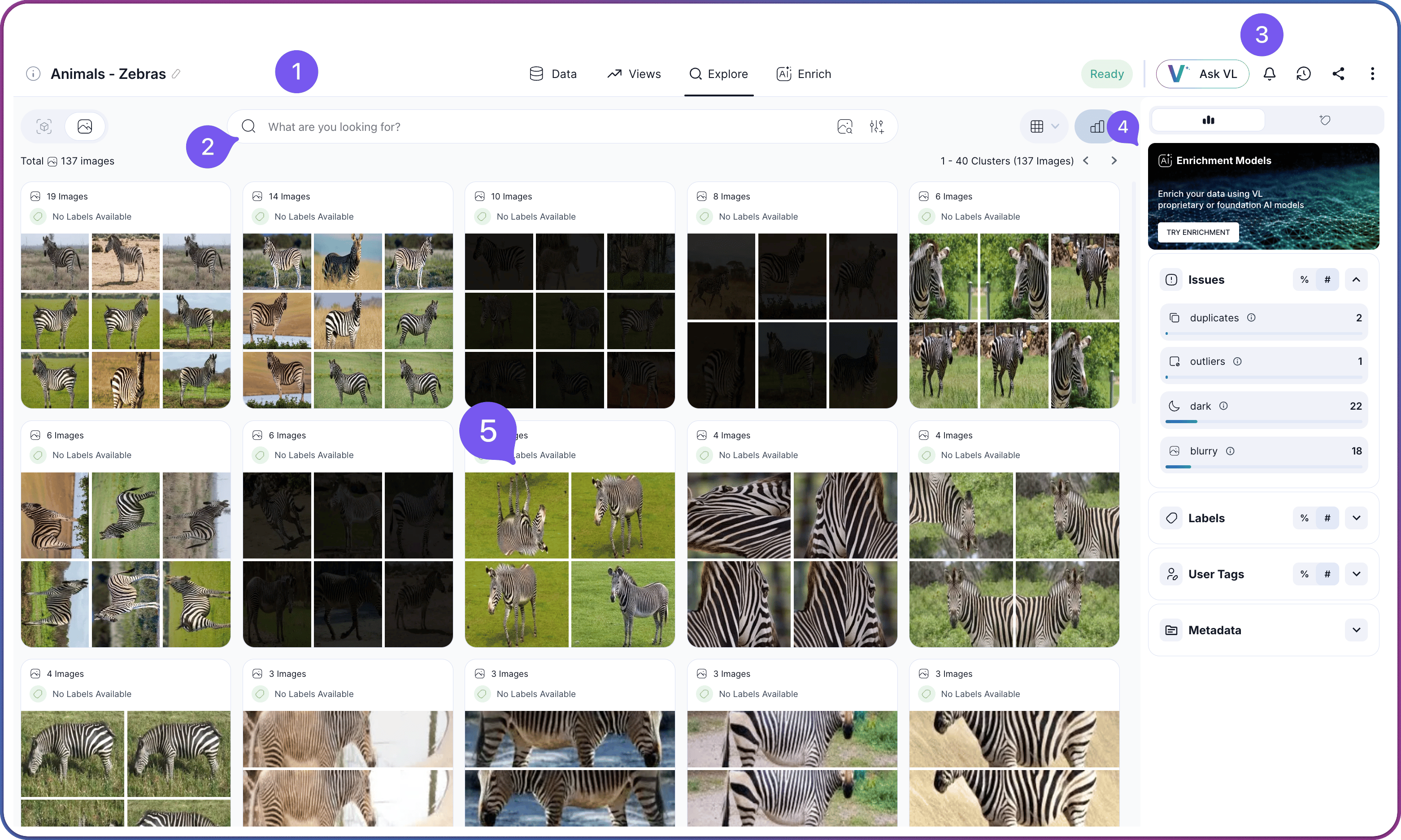
Layout Overview
The Explore tab is organized into four numbered regions that stay in place as you navigate, plus the Insights Panel on the right.| # | Region | Purpose |
|---|---|---|
 | Top Header | Dataset title, dataset-level stats, status indicator, and the tab row for Data, Views, Explore, and Enrich |
 | Filter & Search Area | Search Type Toggle, Layout Toggle, Search box, and Filter Menu |
 | Dataset Actions | Dataset-wide controls on the right side of the top header: status, VL Chat, notifications, share, and the three-dot menu |
 | Content Grid | The main display area showing clusters, images, or objects |
Top Header
The top header is the orientation strip across the very top of the workspace. It identifies the dataset and hosts the tab row.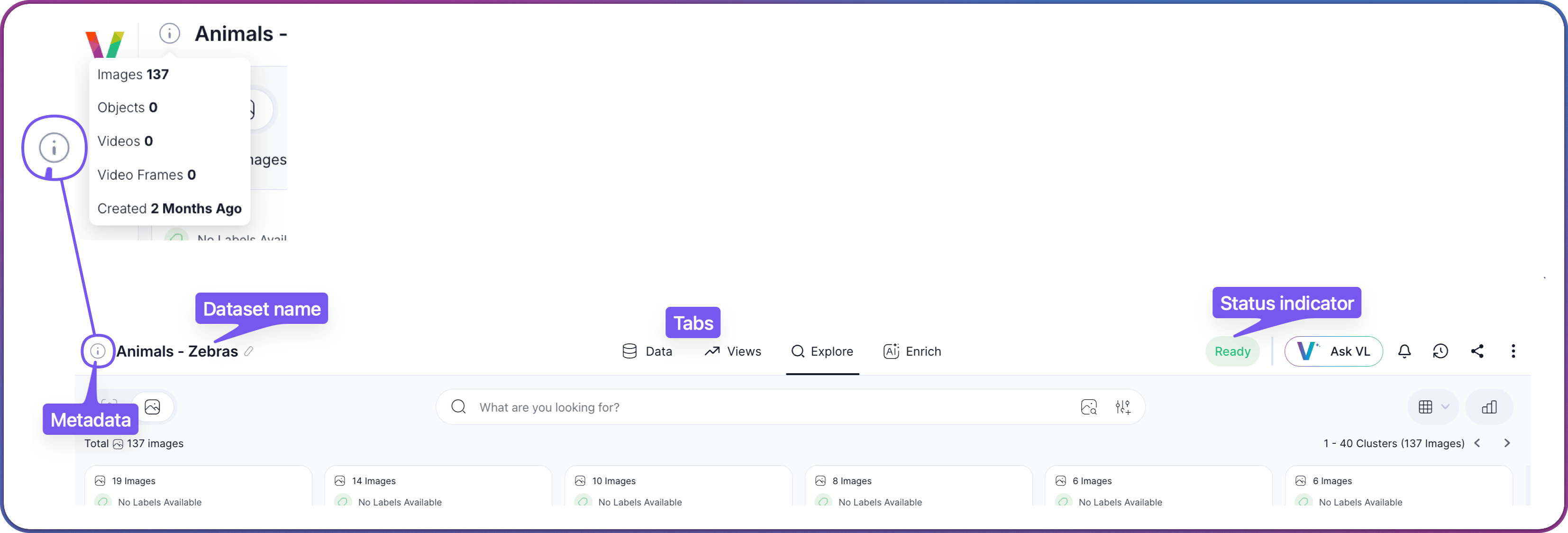
Dataset-wide controls sit on the right side of the top header and are documented in Dataset Actions below.
Filter & Search Area
The filter and search area is the horizontal row directly beneath the header. It holds the Search Type Toggle on the left, the Layout Toggle on the right, and the Search box and Filter Menu in the center.
Search Type Toggle
The Search Type Toggle on the left side of the filter and search area sets what you are searching against: Images or Objects. This is more than a cosmetic change — it determines which embeddings are used for search, which metadata appears in the workspace, and what every filter, search, and hover action operates on.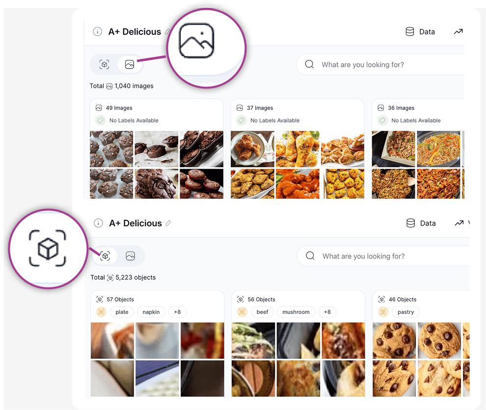
Labels, Captions, and User Tags
Each cluster card displays one metadata type at a time. Use the switch at the top of the cluster to change which metadata is shown.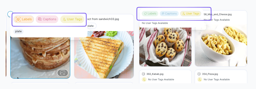
Which labels and captions appear on a cluster depends on which enrichment models have run against the dataset. For the full mapping of models to the metadata they produce, see the Model Catalog. To run or add models, go to the Enrich tab.
Layout Toggle
The Layout Toggle on the right side of the filter and search area switches between Visual Similarity (clustered) and Flat View. It controls how the content grid is arranged, not what appears in it, so it combines with the Search Type Toggle to produce clustered images, clustered objects, a flat image grid, or a flat object grid.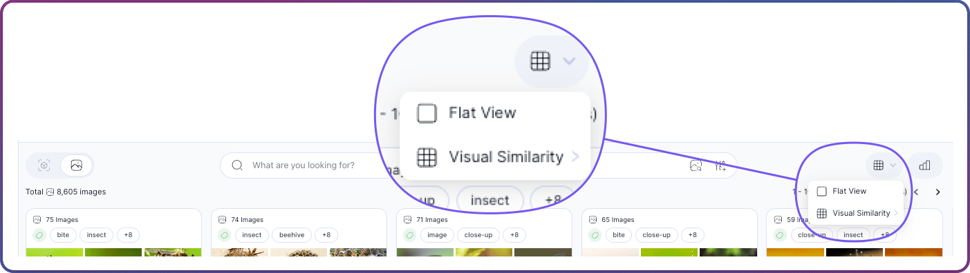
Search Box
The center of the filter and search area contains the Search box and two adjacent buttons.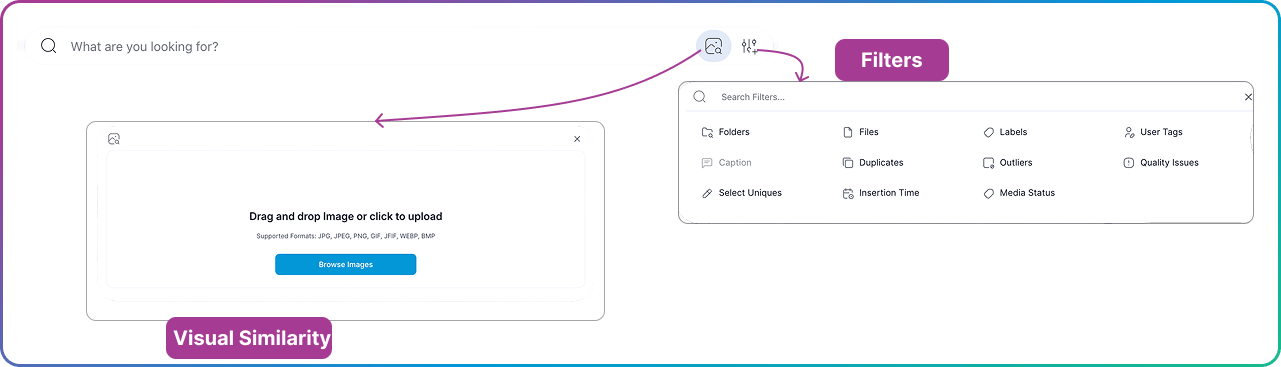
Filter Controls
The filter controls build and manage the active query. Click the Filter Menu icon next to the Search box to open the filters menu.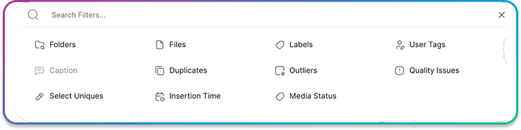
Selecting a filter opens the Query Modal for operator and threshold configuration. Active filters appear as chips in the Query Panel below the bar, combined with AND logic. A chip can be edited by clicking it, removed with X, or cleared entirely with Clear All. Save View stores the current filter combination as a named view, which then appears in both the Save View dropdown and the Views tab.
For every operator, threshold, and filter-specific workflow, see the Filter Options Reference.
Dataset Actions
Dataset Actions occupy the right side of the top header and apply to the entire dataset, regardless of which tab is open.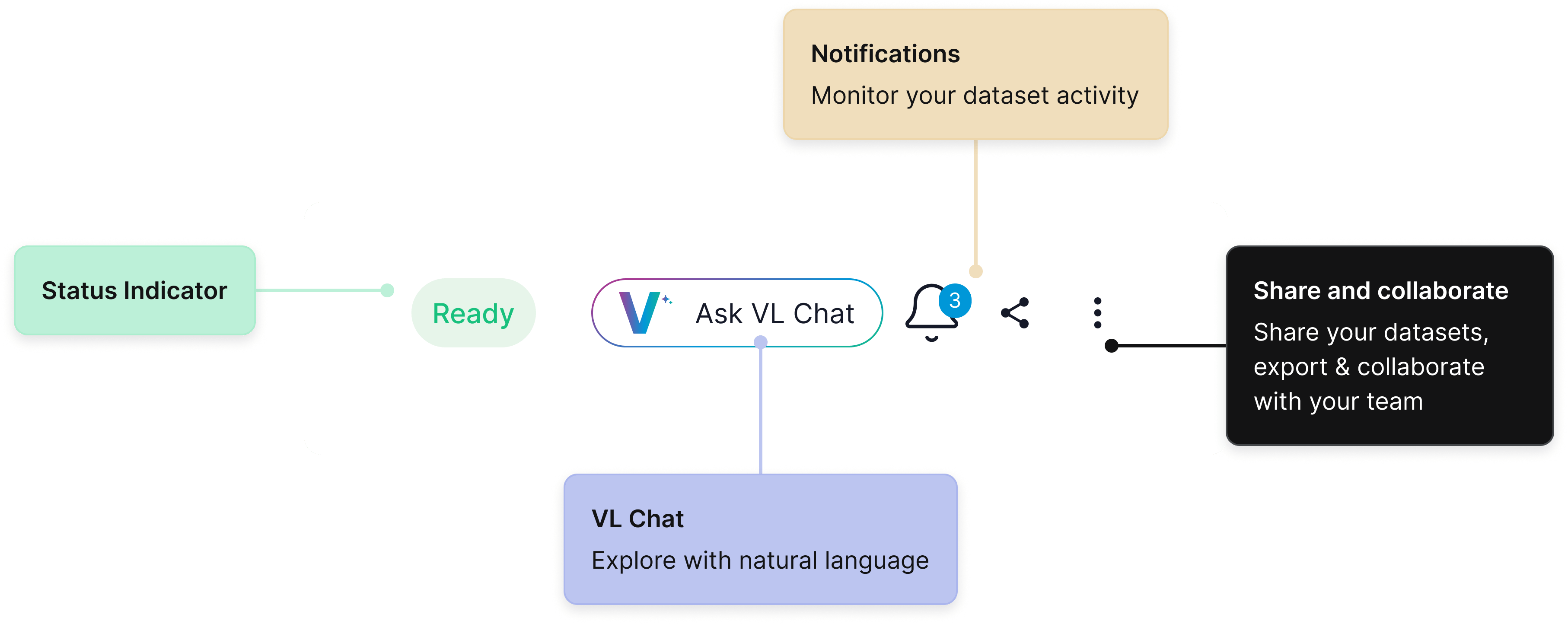
Content Grid
The content grid is the main display area and the source of all in-place actions. Its contents depend on the active layout selected from the Layout Toggle and the search type selected from the Search Type Toggle.Cluster View
In Visual Similarity mode, the grid displays cluster cards. Each card shows a representative thumbnail, the cluster size, and label coverage. When the Search Type Toggle is set to Objects, each card groups detected object crops instead of full images.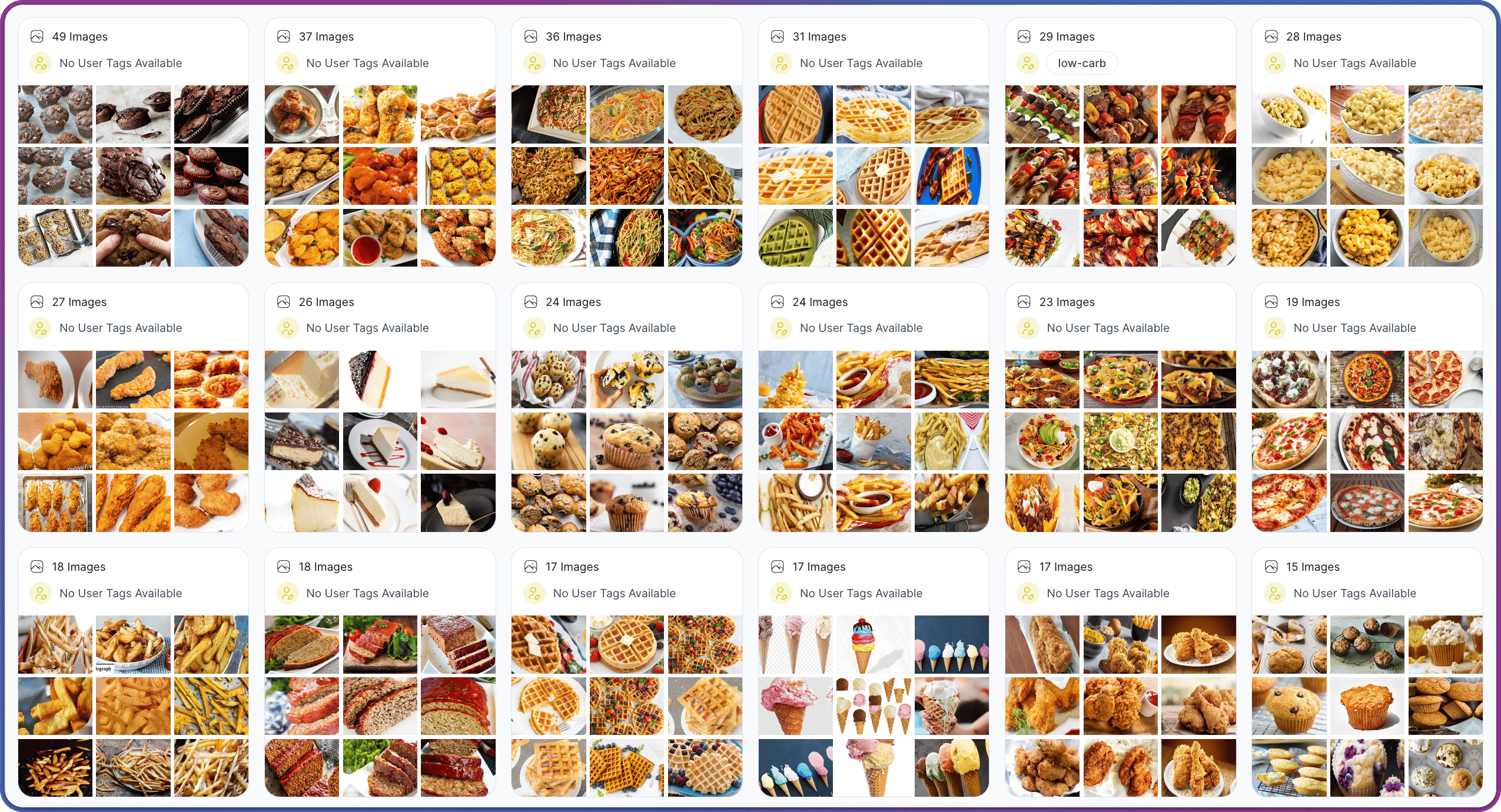
For the concepts behind clustering and embeddings, see How Search & Filter Work. For cluster navigation tips and examples, see Understanding Clusters. For multi-step workflows that combine clusters with filters, see Recipes.
Flat View
In Flat View, the grid displays every item in a single ungrouped layout. When the Search Type Toggle is set to Images, each cell is a full image; when set to Objects, each cell is a detected object crop. Object-level browsing becomes available once an object-detection model has run against the dataset — see the Enrich tab for the workflow.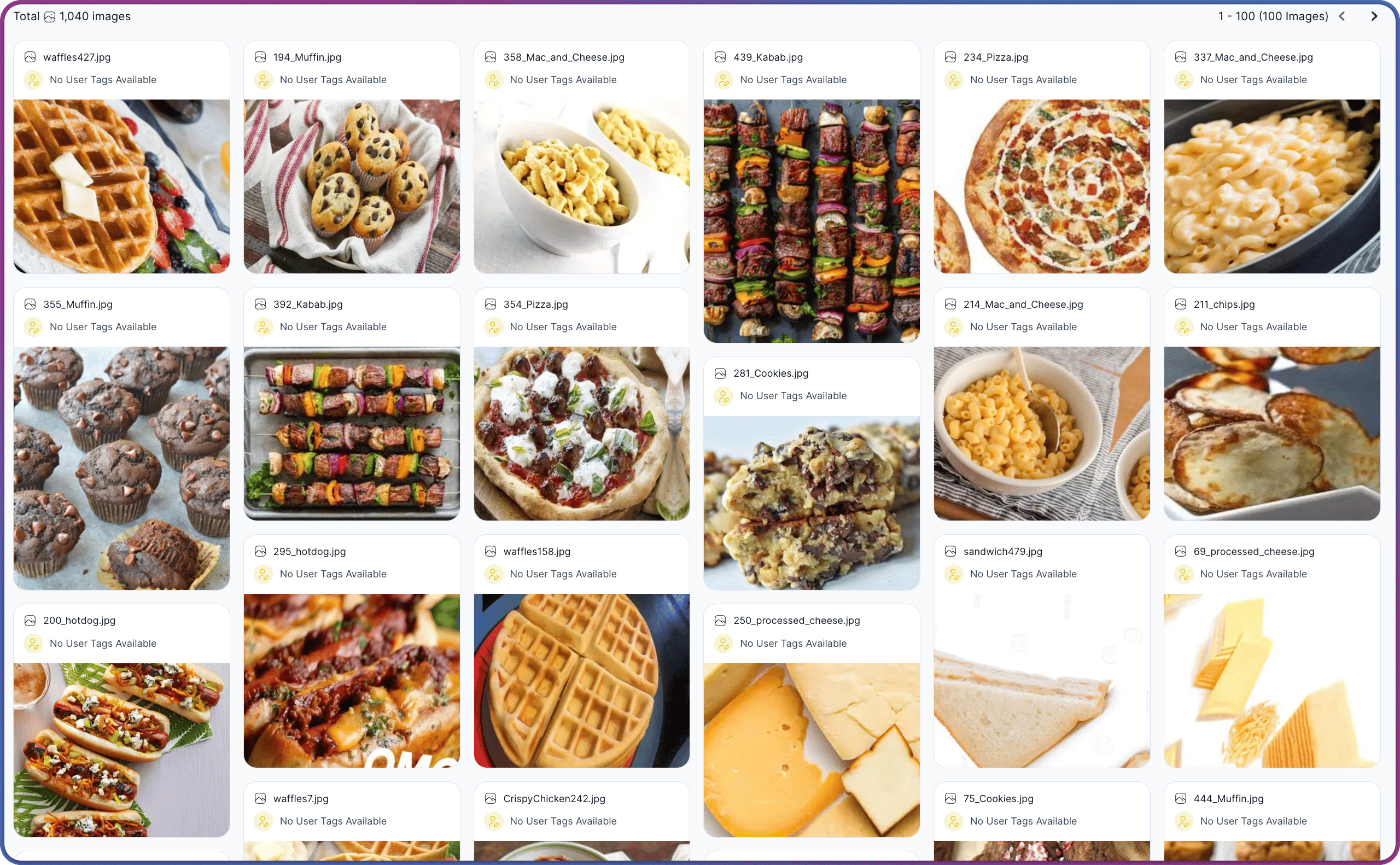
Clicking an image opens its details page, where a Region of Interest crop can launch a crop-based Find Similar search. See Search Against a Region of Interest for the full flow.
Insights Panel
The Insights Panel runs along the right edge of the workspace and shows insights about the current view or selection. Its panels update as filters change, views change, or items are selected.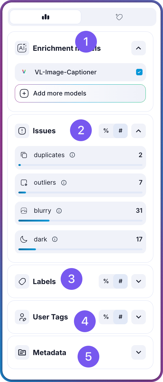
| # | Panel | Description |
|---|---|---|
| Enrichment Models | The models that have run against the dataset and any available preview shortcuts. See Enrich Your Datasets for the run flow and the Model Catalog for every available model. |
| Issues | Quality-issue counts with drill-in links for each category: Duplicates, Outliers, Dark, and Blurry. Clicking any row applies the corresponding filter. For the signal-quality concepts behind these categories, see How Signal Quality Is Measured. |
| Labels | The label distribution for the current view. Clicking a label filters by it. To bring labels in from an external annotation file, see Importing Annotations. |
| User Tags | The user tags applied to items in the current view. Clicking a tag filters by it. See Tag Items for how tags are created and managed. |
 | Metadata | The custom metadata fields available for filtering. See Custom Metadata for how to attach metadata at creation time or via the API. |
Related Resources
Dataset Interface Reference
Overview of the full dataset workspace and the four tabs
How to Search & Filter
Step-by-step guide to running searches and filters
Views Tab
Saved combinations of filters and search queries
Enrich Tab
Model selection and enrichment progress tracking